In the simplest sense of the word, a map is a spatial representation of something. It provides us with a sense of context, scale and location. Maps began as 2D depictions, but technology and data enable maps to become dynamic, real-time and compelling visualizations of how we live and move.
Below, we've rounded up 21 awesome maps from around the web. Some will help you navigate your city, some show the actual mapmaking process and some are just mindblowing visualizations of people flowing throughout cities. No matter what kind of map it is though, it hammers home the exciting pulse and pace of urban life.
1. New York Transit: One Day of MTA Activity
New York City's MTA transports approximately seven million people every day. One YouTube user (correctly) thought it would be interesting to visualize commutes throughout all five boroughs from 4 a.m. to 4 p.m.
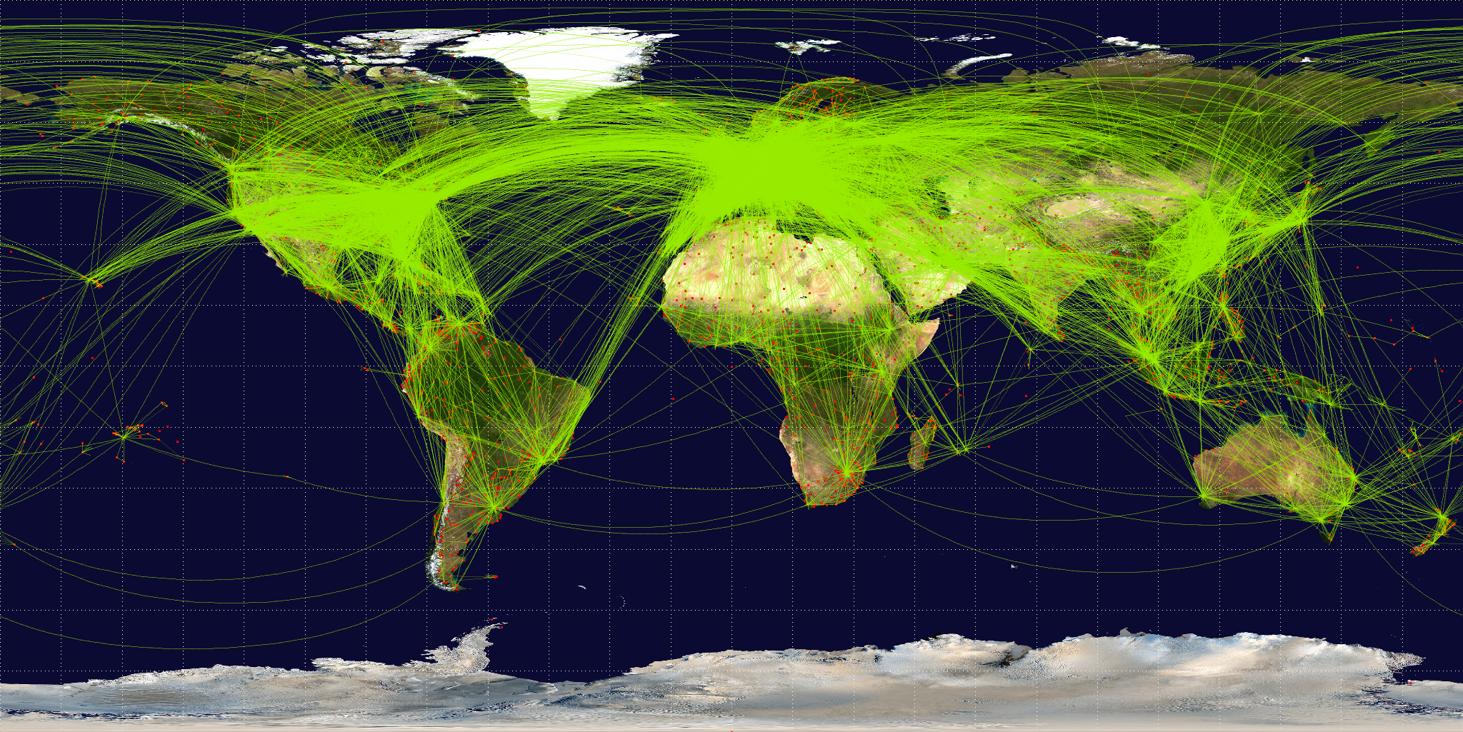
2. Global Flight Paths
What faster way to get from one country's metropolis to another? Flight. As of January 2012, the OpenFlights/Airline Route Mapper Route Database had information on 531 airlines flying 59,036 routes between 3,209 airports; these routes are shown in the image above. (All of the airports of the world, according to this same database, are shown in the image at the top of this article.)
3. CityMaps
The CityMaps app was founded in 2010 as a social map to help people discover the places in their city. It maps out city landmarks — shops, sites, restaurants, cafes — on a simple interface that's somewhat reminiscent of a shopping mall legend. Venue names line the map's streets, peppered in with logos of big chains like McDonald's and Starbucks.
4. High-Speed Rail Map
Whether a high-speed rail system ever gets built in the United States is still up in the air, but if it is, artist and activist Alfred Twu figured out exactly where those speedy rail lines should go. Twu started working on this map in 2009, when President Obama's plan to build high-speed rail was unveiled. "There were many such maps being made by various designers," says Twu, but since then he's updated the map with labels and put it on Facebook, where it went viral.
5. A More Geographically Accurate London Underground
The London Underground map was designed by Harry Beck and published in 1933. While it's streamlined and colorful and gives a bird's eye view of the system, it's not exactly geographically accurate. In fact, a lot of people end up taking a longer route than necessary because it looks like the shortest route on the map. The map above, designed by Mark Noad, shows the stations of the London Underground closer to their true geographic position; it's a compromise between the clean lines of Beck's map and the true layout of the system.
6. Instahood
Looking for a more intimate view of an street than you can get on Google Street View? Instahood lets you zoom in on any area of the world and see Instagrams that have been geotagged to that location.
7. U.S. Interstate Subway System
Cameron Booth is a graphic designer in Sydney, Australia. In the map above, he reimagines American cities as stops on part of an interstate subway system that's reminiscent of the London Underground.
8. Tetsudo Now
Tokyo is home to the busiest subway system in the world, transporting 6.31 million passengers every day. Tetsudo Now is a real-time Google map of the city's public transit — subways and busses — that dynamically update so commuters know where trains and busses are at any given moment. The animated subways and busses mosey along the lines based on transit timetables.
9. A City's Heartbeat: Geneva
A City's Heartbeat uses Google Maps, CartoDB and D3.js to colorfully and dynamically visualize Geneva's urban transport system over a two-day period. Filters on the interactive map let you see train activity at each station and the volume of people (shown above), so you can get a sense of the pulse of the city as its inhabitants go about their daily lives.
10. London's Oyster Card Tap-Ins
Oliver O'Brien is a researcher at University College London who focuses on spatial visualizations, especially in London. The video above is an animation of Oyster Card (commuter smartcard) taps in and out of London's tube and rail stations. Taps are recorded in 10-minute intervals, and red represents flow into the system, while green indicates exiting a station. Oyster Card data was provided by Transport for London, and this video is a recording of an OpenLayers map produced by O'Brien at UCL for the exhibit.
11. San Francisco's Michelin-Starred Restaurants
A huge component of travel is tasting the cuisine of the region you're visiting. Global standards like the Michelin Guide make it easy for tourists to know what are the best (and sometimes, the priciest) restaurants in a city. Food blog Eater mapped San Francisco's Michelin-rated restaurants on a Google map so hungry residents and visitors could put the restaurant's location into context.
12. Real-Time Ottawa Traffic
Cities are congested, and it's estimated that by 2050, 6.3 billion of the world's 9.3 billion inhabitants will live in cities. That has many implications, but one major issue with this increased population density is automobile traffic. Cities around the globe are implementing smart solutions to manage traffic flow and disseminate important traffic information. The Google map above illustrates the City of Ottawa's interactive traffic map, which shows traffic conditions in real time (thanks to traffic camera), as well as accidents, construction, parking and bike routes.
13. Tweat.it
Food trucks are all the rage, and the Tweat.it Google map pulls locations from food truck tweets and plots them on a map, using the truck's logo as a marker. If the truck moves or shuts down for the day, the Tweat.it map is updated.
14. Mapped in Israel
Wandering the streets of Tel Aviv? You can pop into one of the bustling city's hustling startups by tapping into Mapped in Israel. The interactive map lets you filter the country's startup scene by accelerators, startups, investors, co-working spaces and more. (There's a similar map in New York City that lists all Made in NY startups.)
15. London Cycle Map
This London cycle map was designed by Simon Parker and also inspired by Harry Beck’s London Underground map. As more cities implement bike-sharing programs, it's crucial for cities to create safe roads for drivers and cyclists alike.
16. Foursquare Check-Ins in New York & Tokyo
More than 30 million people worldwide use Foursquare, and they've logged more than 3 billion check-ins to date. Because people use Foursquare in real-time, the app functions as a sort of virtual itinerary tracker and has collected a lot of data since its 2009 launch. Foursquare recently sought to visualize this data, plotting a year's worth of check-ins in New York City and Tokyo and pressing fast-forward. Each dot in the video above represents one check-in, while lines indicate sequential check-ins. Much like the Geneva heartbeat video above, this data visualization illustrates the pulse of the city.
17. 201 Bike Commutes
Briton Aidan Samuel used Strava to track 201 bike journeys over four months, all transposed into a 24-hour period. The map starts pretty quietly and remains quiet until about 6 p.m., illustrating rush hour from a cyclist's point of view.
18. Mapping Bangalore in OpenStreetMaps
OpenStreetMap is an open-source maps API that relies on the contributions of users in a Wikipedia-style format for not only roadmaps but also hiking trails, bike paths and footpaths around the world. It was founded by Steve Coast in 2004 as a one-man project, and it boasts more than 500,000 volunteers across the globe. This video shows the process of mapping Bangalore's roads that started in 2007, driving home how much work goes into to mapping the globe's cities on the open-source platform.
19. Sumus Technology's Transit Maps
If you go to the Sumus website and click on any of the green busses on the map, and you'll be able to see a video that shows public transit activities that city. The videos are created with General Transit Feed Specification (GTFS) data, and each point represents one vehicle. Each video tracks urban mobility for one weekday, letting you visualize the movements of a population on the go. Cities that have been visualized and are available on the YouTube channel include Sydney, Honolulu, Dublin and Madrid.
by Lauren DrellApr
 Below, we've rounded up 21 awesome maps from around the web. Some will help you navigate your city, some show the actual mapmaking process and some are just mindblowing visualizations of people flowing throughout cities. No matter what kind of map it is though, it hammers home the exciting pulse and pace of urban life.
1. New York Transit: One Day of MTA Activity
New York City's MTA transports approximately seven million people every day. One YouTube user (correctly) thought it would be interesting to visualize commutes throughout all five boroughs from 4 a.m. to 4 p.m.
2. Global Flight Paths
What faster way to get from one country's metropolis to another? Flight. As of January 2012, the OpenFlights/Airline Route Mapper Route Database had information on 531 airlines flying 59,036 routes between 3,209 airports; these routes are shown in the image above. (All of the airports of the world, according to this same database, are shown in the image at the top of this article.)
3. CityMaps
Below, we've rounded up 21 awesome maps from around the web. Some will help you navigate your city, some show the actual mapmaking process and some are just mindblowing visualizations of people flowing throughout cities. No matter what kind of map it is though, it hammers home the exciting pulse and pace of urban life.
1. New York Transit: One Day of MTA Activity
New York City's MTA transports approximately seven million people every day. One YouTube user (correctly) thought it would be interesting to visualize commutes throughout all five boroughs from 4 a.m. to 4 p.m.
2. Global Flight Paths
What faster way to get from one country's metropolis to another? Flight. As of January 2012, the OpenFlights/Airline Route Mapper Route Database had information on 531 airlines flying 59,036 routes between 3,209 airports; these routes are shown in the image above. (All of the airports of the world, according to this same database, are shown in the image at the top of this article.)
3. CityMaps
 The CityMaps app was founded in 2010 as a social map to help people discover the places in their city. It maps out city landmarks — shops, sites, restaurants, cafes — on a simple interface that's somewhat reminiscent of a shopping mall legend. Venue names line the map's streets, peppered in with logos of big chains like McDonald's and Starbucks.
4. High-Speed Rail Map
The CityMaps app was founded in 2010 as a social map to help people discover the places in their city. It maps out city landmarks — shops, sites, restaurants, cafes — on a simple interface that's somewhat reminiscent of a shopping mall legend. Venue names line the map's streets, peppered in with logos of big chains like McDonald's and Starbucks.
4. High-Speed Rail Map
 Whether a high-speed rail system ever gets built in the United States is still up in the air, but if it is, artist and activist Alfred Twu figured out exactly where those speedy rail lines should go. Twu started working on this map in 2009, when President Obama's plan to build high-speed rail was unveiled. "There were many such maps being made by various designers," says Twu, but since then he's updated the map with labels and put it on Facebook, where it went viral.
5. A More Geographically Accurate London Underground
Whether a high-speed rail system ever gets built in the United States is still up in the air, but if it is, artist and activist Alfred Twu figured out exactly where those speedy rail lines should go. Twu started working on this map in 2009, when President Obama's plan to build high-speed rail was unveiled. "There were many such maps being made by various designers," says Twu, but since then he's updated the map with labels and put it on Facebook, where it went viral.
5. A More Geographically Accurate London Underground
 The London Underground map was designed by Harry Beck and published in 1933. While it's streamlined and colorful and gives a bird's eye view of the system, it's not exactly geographically accurate. In fact, a lot of people end up taking a longer route than necessary because it looks like the shortest route on the map. The map above, designed by Mark Noad, shows the stations of the London Underground closer to their true geographic position; it's a compromise between the clean lines of Beck's map and the true layout of the system.
6. Instahood
The London Underground map was designed by Harry Beck and published in 1933. While it's streamlined and colorful and gives a bird's eye view of the system, it's not exactly geographically accurate. In fact, a lot of people end up taking a longer route than necessary because it looks like the shortest route on the map. The map above, designed by Mark Noad, shows the stations of the London Underground closer to their true geographic position; it's a compromise between the clean lines of Beck's map and the true layout of the system.
6. Instahood
 Looking for a more intimate view of an street than you can get on Google Street View? Instahood lets you zoom in on any area of the world and see Instagrams that have been geotagged to that location.
7. U.S. Interstate Subway System
Looking for a more intimate view of an street than you can get on Google Street View? Instahood lets you zoom in on any area of the world and see Instagrams that have been geotagged to that location.
7. U.S. Interstate Subway System
 Cameron Booth is a graphic designer in Sydney, Australia. In the map above, he reimagines American cities as stops on part of an interstate subway system that's reminiscent of the London Underground.
8. Tetsudo Now
Cameron Booth is a graphic designer in Sydney, Australia. In the map above, he reimagines American cities as stops on part of an interstate subway system that's reminiscent of the London Underground.
8. Tetsudo Now
 Tokyo is home to the busiest subway system in the world, transporting 6.31 million passengers every day. Tetsudo Now is a real-time Google map of the city's public transit — subways and busses — that dynamically update so commuters know where trains and busses are at any given moment. The animated subways and busses mosey along the lines based on transit timetables.
9. A City's Heartbeat: Geneva
Tokyo is home to the busiest subway system in the world, transporting 6.31 million passengers every day. Tetsudo Now is a real-time Google map of the city's public transit — subways and busses — that dynamically update so commuters know where trains and busses are at any given moment. The animated subways and busses mosey along the lines based on transit timetables.
9. A City's Heartbeat: Geneva
 A City's Heartbeat uses Google Maps, CartoDB and D3.js to colorfully and dynamically visualize Geneva's urban transport system over a two-day period. Filters on the interactive map let you see train activity at each station and the volume of people (shown above), so you can get a sense of the pulse of the city as its inhabitants go about their daily lives.
10. London's Oyster Card Tap-Ins
Oliver O'Brien is a researcher at University College London who focuses on spatial visualizations, especially in London. The video above is an animation of Oyster Card (commuter smartcard) taps in and out of London's tube and rail stations. Taps are recorded in 10-minute intervals, and red represents flow into the system, while green indicates exiting a station. Oyster Card data was provided by Transport for London, and this video is a recording of an OpenLayers map produced by O'Brien at UCL for the exhibit.
11. San Francisco's Michelin-Starred Restaurants
A City's Heartbeat uses Google Maps, CartoDB and D3.js to colorfully and dynamically visualize Geneva's urban transport system over a two-day period. Filters on the interactive map let you see train activity at each station and the volume of people (shown above), so you can get a sense of the pulse of the city as its inhabitants go about their daily lives.
10. London's Oyster Card Tap-Ins
Oliver O'Brien is a researcher at University College London who focuses on spatial visualizations, especially in London. The video above is an animation of Oyster Card (commuter smartcard) taps in and out of London's tube and rail stations. Taps are recorded in 10-minute intervals, and red represents flow into the system, while green indicates exiting a station. Oyster Card data was provided by Transport for London, and this video is a recording of an OpenLayers map produced by O'Brien at UCL for the exhibit.
11. San Francisco's Michelin-Starred Restaurants
 A huge component of travel is tasting the cuisine of the region you're visiting. Global standards like the Michelin Guide make it easy for tourists to know what are the best (and sometimes, the priciest) restaurants in a city. Food blog Eater mapped San Francisco's Michelin-rated restaurants on a Google map so hungry residents and visitors could put the restaurant's location into context.
12. Real-Time Ottawa Traffic
A huge component of travel is tasting the cuisine of the region you're visiting. Global standards like the Michelin Guide make it easy for tourists to know what are the best (and sometimes, the priciest) restaurants in a city. Food blog Eater mapped San Francisco's Michelin-rated restaurants on a Google map so hungry residents and visitors could put the restaurant's location into context.
12. Real-Time Ottawa Traffic
 Cities are congested, and it's estimated that by 2050, 6.3 billion of the world's 9.3 billion inhabitants will live in cities. That has many implications, but one major issue with this increased population density is automobile traffic. Cities around the globe are implementing smart solutions to manage traffic flow and disseminate important traffic information. The Google map above illustrates the City of Ottawa's interactive traffic map, which shows traffic conditions in real time (thanks to traffic camera), as well as accidents, construction, parking and bike routes.
13. Tweat.it
Cities are congested, and it's estimated that by 2050, 6.3 billion of the world's 9.3 billion inhabitants will live in cities. That has many implications, but one major issue with this increased population density is automobile traffic. Cities around the globe are implementing smart solutions to manage traffic flow and disseminate important traffic information. The Google map above illustrates the City of Ottawa's interactive traffic map, which shows traffic conditions in real time (thanks to traffic camera), as well as accidents, construction, parking and bike routes.
13. Tweat.it
 Food trucks are all the rage, and the Tweat.it Google map pulls locations from food truck tweets and plots them on a map, using the truck's logo as a marker. If the truck moves or shuts down for the day, the Tweat.it map is updated.
14. Mapped in Israel
Food trucks are all the rage, and the Tweat.it Google map pulls locations from food truck tweets and plots them on a map, using the truck's logo as a marker. If the truck moves or shuts down for the day, the Tweat.it map is updated.
14. Mapped in Israel
 Wandering the streets of Tel Aviv? You can pop into one of the bustling city's hustling startups by tapping into Mapped in Israel. The interactive map lets you filter the country's startup scene by accelerators, startups, investors, co-working spaces and more. (There's a similar map in New York City that lists all Made in NY startups.)
15. London Cycle Map
Wandering the streets of Tel Aviv? You can pop into one of the bustling city's hustling startups by tapping into Mapped in Israel. The interactive map lets you filter the country's startup scene by accelerators, startups, investors, co-working spaces and more. (There's a similar map in New York City that lists all Made in NY startups.)
15. London Cycle Map
 This London cycle map was designed by Simon Parker and also inspired by Harry Beck’s London Underground map. As more cities implement bike-sharing programs, it's crucial for cities to create safe roads for drivers and cyclists alike.
16. Foursquare Check-Ins in New York & Tokyo
More than 30 million people worldwide use Foursquare, and they've logged more than 3 billion check-ins to date. Because people use Foursquare in real-time, the app functions as a sort of virtual itinerary tracker and has collected a lot of data since its 2009 launch. Foursquare recently sought to visualize this data, plotting a year's worth of check-ins in New York City and Tokyo and pressing fast-forward. Each dot in the video above represents one check-in, while lines indicate sequential check-ins. Much like the Geneva heartbeat video above, this data visualization illustrates the pulse of the city.
17. 201 Bike Commutes
Briton Aidan Samuel used Strava to track 201 bike journeys over four months, all transposed into a 24-hour period. The map starts pretty quietly and remains quiet until about 6 p.m., illustrating rush hour from a cyclist's point of view.
18. Mapping Bangalore in OpenStreetMaps
OpenStreetMap is an open-source maps API that relies on the contributions of users in a Wikipedia-style format for not only roadmaps but also hiking trails, bike paths and footpaths around the world. It was founded by Steve Coast in 2004 as a one-man project, and it boasts more than 500,000 volunteers across the globe. This video shows the process of mapping Bangalore's roads that started in 2007, driving home how much work goes into to mapping the globe's cities on the open-source platform.
19. Sumus Technology's Transit Maps
If you go to the Sumus website and click on any of the green busses on the map, and you'll be able to see a video that shows public transit activities that city. The videos are created with General Transit Feed Specification (GTFS) data, and each point represents one vehicle. Each video tracks urban mobility for one weekday, letting you visualize the movements of a population on the go. Cities that have been visualized and are available on the YouTube channel include Sydney, Honolulu, Dublin and Madrid.
by Lauren DrellApr
This London cycle map was designed by Simon Parker and also inspired by Harry Beck’s London Underground map. As more cities implement bike-sharing programs, it's crucial for cities to create safe roads for drivers and cyclists alike.
16. Foursquare Check-Ins in New York & Tokyo
More than 30 million people worldwide use Foursquare, and they've logged more than 3 billion check-ins to date. Because people use Foursquare in real-time, the app functions as a sort of virtual itinerary tracker and has collected a lot of data since its 2009 launch. Foursquare recently sought to visualize this data, plotting a year's worth of check-ins in New York City and Tokyo and pressing fast-forward. Each dot in the video above represents one check-in, while lines indicate sequential check-ins. Much like the Geneva heartbeat video above, this data visualization illustrates the pulse of the city.
17. 201 Bike Commutes
Briton Aidan Samuel used Strava to track 201 bike journeys over four months, all transposed into a 24-hour period. The map starts pretty quietly and remains quiet until about 6 p.m., illustrating rush hour from a cyclist's point of view.
18. Mapping Bangalore in OpenStreetMaps
OpenStreetMap is an open-source maps API that relies on the contributions of users in a Wikipedia-style format for not only roadmaps but also hiking trails, bike paths and footpaths around the world. It was founded by Steve Coast in 2004 as a one-man project, and it boasts more than 500,000 volunteers across the globe. This video shows the process of mapping Bangalore's roads that started in 2007, driving home how much work goes into to mapping the globe's cities on the open-source platform.
19. Sumus Technology's Transit Maps
If you go to the Sumus website and click on any of the green busses on the map, and you'll be able to see a video that shows public transit activities that city. The videos are created with General Transit Feed Specification (GTFS) data, and each point represents one vehicle. Each video tracks urban mobility for one weekday, letting you visualize the movements of a population on the go. Cities that have been visualized and are available on the YouTube channel include Sydney, Honolulu, Dublin and Madrid.
by Lauren DrellApr


